|
|
 |
Order and intuition: Siemens' Brand
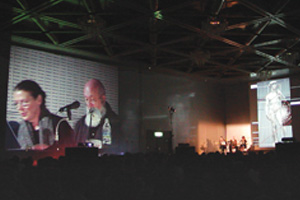
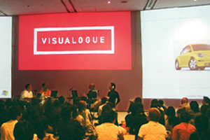
In the beautifully 'Visualogued' conference room with four large screens,
German designers Baumann dually shared their philosophy of design in
the context of a 3 year long identity project for Siemens. The size of
the project -Siemens is the largest company in Germany-required a complete
understanding of the company, which the designers referred to as the
Siemens Profile finding the term corporate identity an inappropriate
description. Quoting Aristotle's "The whole is greater than the
sum of its parts" the designers stressed the importance of getting
it right before the design rules and codes are implemented. Two seemingly
opposite themes became apparent in their process: science, logic and
order and intuition and nature. Examples from Michelangelo, the golden
rule, architecture, mathematics and science described the former, examples
of painting, sculpture and haiku the latter. The tension created between
the two is important it opens the door to new possibilities and solutions.
Since Siemens is a large, global company, it was extremely important
for the designers to remain open to these new possibilities. The commonality
between the two approaches was order. The designers emphasized the delicate
balance needed on order to effectively "make the human life human" in
their designs. These analogue elements of life will never be replaced
by the order of the digital, but new media and technology as a tool is
useful in understanding and managing the growing complexities of life.
Such is reflected in the brand of Siemens. (RZ)
|
|
 |
|
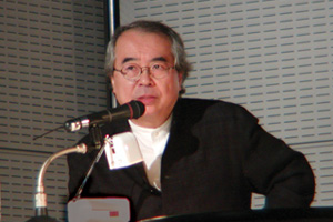
Starting from zero
Commenting designers Baumann's beautiful and well - organized presentation,
Matsunaga-san apologized for his presentation and asked for patience
from the audience. But there was no need as the images that followed
in the 20 minute show were equally beautiful and well thought out. Matsunaga
let his 36 years of work speak for himself. Images from his book, "Graphic
Cosmos, the Work of Shin Matsunaga", danced across the screens in
sync to the soundtrack, revealing a strong sense of simple shape, strong
line and vivid use of color. Many of his designs, ranging from environments,
products, sculptures, packages, books, and logotypes, can be found on
the store shelves and homes of Japan today. After viewing the presentation
he commented on how now, after years, he is able to look at his body
of work and feel good. In his college days, his design program covered
a wide spread of arts and crafts and looking back, appreciated the value
now as a graphic designer. A little painter and a little artist is how
he described himself. After 64 Olympics, he opened his own design office,
beginning from zero. Risk was important, teaching him not to spare anything
when developing a design. (RZ)
|
|
 |
|
 |
|
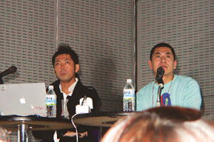
| Katsunori Aoki (Japan), Kashiwa Sato (Japan) |
|
Border breaking communication
Katsunori Aoki and Kashiwa Sato presented their stimmulating works to
a fully crowded auditorium, which is proof of their famous image among
the Japanese design society. Among their clients since 15 years work
experience are outstanding names, e.g. Kirin Lager Beer, Smap , AIWA,
Chibi Lemon drink, Shiseido, Parco fashion stores, and others. Both presented
exciting creative solutions for commercials and other medias which documentate
their belief that art direction allows experimental projects for outstanding
communications. They also think that their way of creative art direction
has more effects and better results than corporate identity or packaging
alone. Aoki's and Sato's approach for company communication or branding
comes from an integrated strategy to see communication and branding as
a whole, which includes everything, e.g. identity, writing, packaging,
ads, animations, posters etc. They perform all aspects of striking art
direction, covering as well product development and space design. In
their works they build a new relationship between products and art direction
through versatile use of icons representing a clear, simple and therefore
strong visual image in all phases of communication. They very much believe
that creative art direction allows border breaking communication solutions.
Not surprisingly they have won many high ranking awards in various catergories,
e.g. Tokyo Type Directors Club Gold Prize or Japan Package Design Golden
Award. (HL)
|
|
 |
|
 |
|
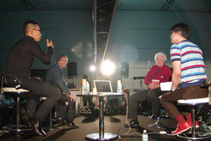
Dr. Robert Moog (USA)
Moderator: Ichiro Higashiizumi (Japan), Taku Satoh (Japan), Tom Vincent (UK) |
|
Interpreting interactivity
In a room filled to capacity, moderators Ichiro Higashizumi, Taku Satoh
and Tom Vincent began the session with a short discussion on what interactive
design means to each designer. After setting the context, Dr. Robert
Moog joined the three. Conversation ran the gamut, frequently touching
base on the session topic 'Interactive design that manipulates the senses'.
Meaningful was the joint interpretation on the definition of interactive
design. It was a definition that weaves its way through various design
disciplines, references 'interaction' and involves the five senses on
an individual level.
Higashizumi's metaphor of a cat beautifully illustrates this: Imagine
meeting a cat in the alley. When it sees you it runs away, stopping after
reaching a safer distance. It turns to look at you. You stretch out your
hand, it backs up. You move forward, it moves forward. You stand still,
it stands still. That relationship is interaction design, a "tug
of war" between person, animal, environment, and object. Interactive
design though a popular term, is not specific to a certain design discipline.
It has a reference to 'use' and therefore can be understood through various
disciplines. Originally thought of in a PC "click-click" environment
it is inherent in all types of design and its interpretation depends
on specific individual experiences -a theme that is recurring throughout
the conference.
Later, Dr. Moog talked of the challenge in developing the interface between
the musician and the control panel. The final solution involved smart
haptic feedback between the user and the knobs, patch cords, switches
and dials. "Most of us react to objects on a level below the surface,
how it feels, how it sounds, what it feels like-all these things together
effect our perception. I don't think any one of these is more important
than the other". When asked "why did you get involved in music?" he
had an interesting reply: curiosity and a desire to animate electronic
circuitry, to answer the question "What sound could this piece of
wire make?" In this way, Robert Moog who describes himself as an
engineer, is a designer as well.(RZ)
|
|
 |
|
 |
|
| Bill Buxton (Canada), Anirudha Joshi (India), Steve Kaneko (USA), Takehiko Katsuo (Japan) |
|
From Noise to Experience Design
All design is about creating experiences, whether you call it interface
design, interaction design, product design or any of the other flavors
of job title in the design field. Steve Kaneko's group at Microsoft starts
by developing an understanding of who will use their product, then looks
at the context in which the product will be used to help them create
scenarios or storyboards of how a product will be used. Scenarios help
them define what the product should do, which in turn helps them decide
what form the product should take and what technology is appropriate.
Starting from this point of understanding needs and context is crucial
for any kind of design, including graphic design. Bill Buxton explicitly
makes the connection between experience design and graphic design by
pointing out that page layout involves the same principles of experience
design: acting as a director of the reader's movement through an information
space, the designer guides the eye to focus through a series of moments
throughout the layout or document, using graphic language to control
timing and emphasis, as well as the interpretive nuances that will support
and enhance the message. Without such guidance, or sense-making that
the designer contributes, what we are dealing with is not information,
but mere data or possibly noise. Buxton describes five states that input
can be at: noise, data, information, knowledge, understanding, and wisdom.
Terms such as the information society, information superhighway, information
technology are misleading: unless the visual and audio information we
take in constitute something that a person can use to make an informed
decision, then we are in fact talking not about information, but at best
about data, and possibly just about noise, a condition that sadly describes
our information society.(GW)
|
|
 |
|
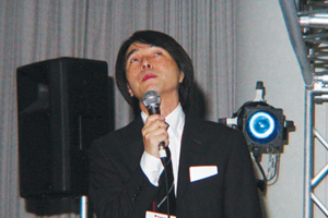
Graphic Sound: Sound Design and Sato
Sato Masahiko began his presentation by describing his life in the world
of design.
He had a great interest in expressing things though was poor at painting.
As a boy he collected interesting images of package design - attractive
cardboard boxes, tickets, subway schedules, seat layouts but could not
use a ruler well. "What am I interested in?" He would ask himself.
What he discovered was his interest in a creating a method of creating.
So what does that make him? What that makes Masahiko-san is a sound designer.
His sounds always accompany imagery, specifically film, another childhood
interest, yet it is the sound which creates the impact of the piece.
In fact, the creative process or approach for each project (almost 300
to date) begins with the selection of sound. He refers to this approach
as a method. Another method is his use of reductionism throughout his
work. His commercials are quite simple in visual appearance, only partial
elements or simple set ups are used. It is the addition of sound that
makes them rich and appealing, specifically the rhythmic, catchy and
emotionally familiar sounds he chooses. Masahiko-san's sound is symbolic,
or iconic. It sits in a context, and needs a context to be understood.
He is well aware of this context and uses it to create incredibly powerful
commercial designs. He is now passing his 'methodology' down to his students.
(RZ)
|
|
 |
|
Writer:Kosuke Ikehata/Norimitsu Korekata/Junko Sakamoto/Nobuko
Shimuta/Naoko Hasegawa/Osamu Hisanaga/Sakurako Muto/Naho Yoshioka/Helmut Langer/Maggie Hohle/Nicole Rechia/Trysh Wahlig/Gitte Waldman/Robert Zolna
Photographer:Yoshimitsu Asai/Yasuhiko Katsuta/Fumihiko Mizutani |
|
|